
Debugging layout sizing problems in Flutter
In this post, we will use an example to demonstrate how to debug layout sizing problems in Flutter & fix them. If you're looking for ways to debug common layout problems like widget overflow, sizing, etc., related to Column and Row widgets, then you're in the wrong place! I would recommend reading this excellent article by Katie Lee that goes in-depth explaining how to debug such common layout problems using Dart DevTools.
In fact, after learning about this process from her article last week, I stumbled upon one such issue in my work project. What a coincidence! :p
In this post, we will go through the entire debugging process and fix one such problem by reading Flutter documentation and using Dart Dev tools. I promise it is better than going through trial-and-error approaches or looking for Stackoverflow answers 😜. It also helped me learn key Flutter concepts related to BoxConstraints, ModalBottomSheet, Align, Stack, and Positioned widgets. I hope this might be helpful to someone in future. So, without any further delay, let's start 🚀
I've divided this post into the following four parts:
Explaining Problem
Bottom sheets have become the standard way of showing inline menus or simple confirmation dialogs on Mobile apps. Flutter provides showModalBottomSheet method to show such non-persistent bottom sheet dialogs.
In one of my projects, we have to use these bottom sheets on many screens to show confirmation dialogs. And the widget structures are similar in most of those dialogs.
Code:
Column(
    mainAxisSize: MainAxisSize.min,
    mainAxisAlignment: MainAxisAlignment.start,
    crossAxisAlignment: CrossAxisAlignment.stretch,
    children: [
        titleText,
        contentText,
        if(_mutipleCTAButtons_ != null) ..._multipleCTAButtons,
        else commonCTAButton
    ]
)
Visually:
Considering our layout is quite common in all these dialogs, we decided to create a wrapper function over the showModalBottomSheet API.
This lets us avoid writing boilerplate code whenever we need to make any such bottom sheet dialog.
Our wrapper function looked like the one below.
import 'package:flutter/material.dart';
Future<T> showBottomDialog<T>({
BuildContext context,
String title,
String content,
Widget titleWidget,
Widget contentWidget,
List<Widget> actions,
bool allowBackNavigation = false,
}) {
assert(title != null || titleWidget != null,
'title and titleWidget both must not be null');
assert(content != null || contentWidget != null,
'content and contentWidget both must not be null');
final theme = Theme.of(context);
return showModalBottomSheet(
context: context,
shape: RoundedRectangleBorder(
borderRadius: const BorderRadius.only(
topLeft: Radius.circular(24),
topRight: Radius.circular(24),
),
),
isDismissible: allowBackNavigation,
builder: (context) => WillPopScope(
onWillPop: () async => allowBackNavigation,
child: Padding(
padding: const EdgeInsets.symmetric(horizontal: 24, vertical: 32),
child: Column(
mainAxisSize: MainAxisSize.min,
mainAxisAlignment: MainAxisAlignment.start,
crossAxisAlignment: CrossAxisAlignment.stretch,
children: [
titleWidget ??
Text(
title,
textAlign: TextAlign.left,
style: Theme.of(context).textTheme.headline2,
),
SizedBox(height: 16),
contentWidget ??
Text(
content,
textAlign: TextAlign.left,
style: Theme.of(context)
.textTheme
.bodyText2
.copyWith(height: 1.5),
),
SizedBox(height: 48),
if (actions != null)
...actions
else
OutlineButton(
child: Text('GOT IT!'),
borderSide: BorderSide(color: theme.primaryColor),
onPressed: () {
Navigator.of(context).pop();
},
),
],
),
),
),
);
}
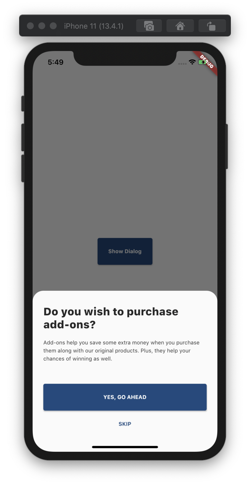
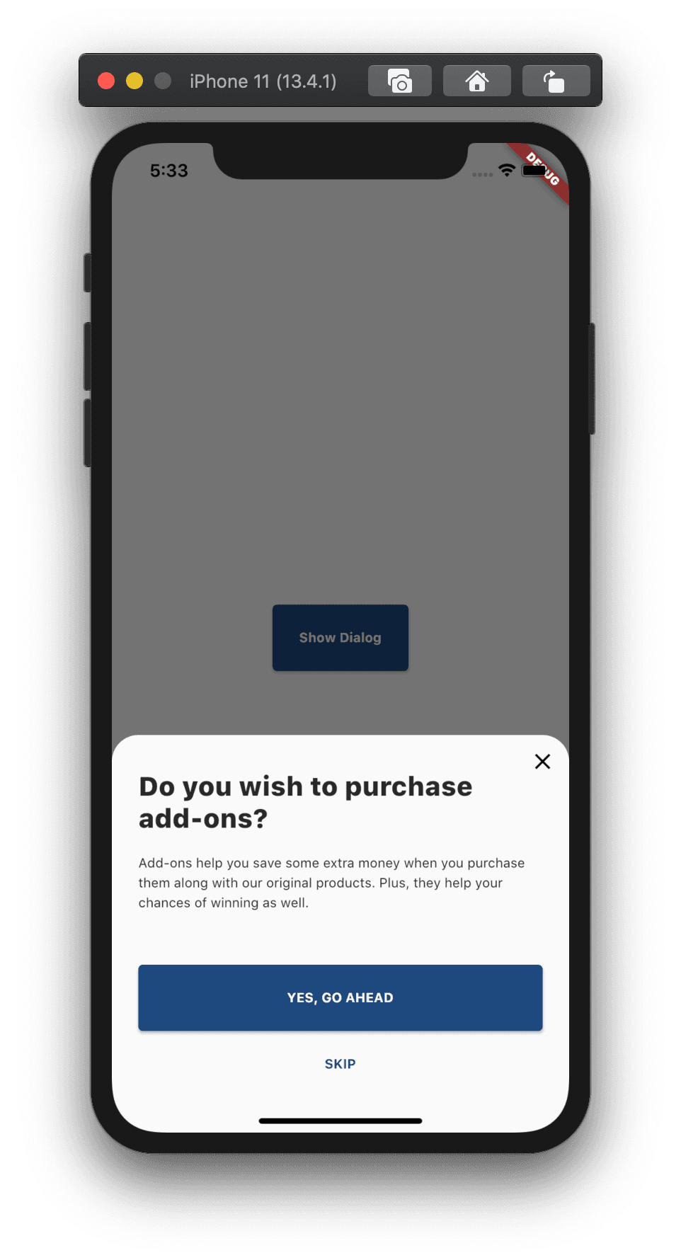
And because of the wrapper function creating a bottom sheet dialog becomes as easy as below:
class DialogExample extends StatelessWidget {
void _showDialog(BuildContext context) {
showBottomDialog(
context: context,
allowBackNavigation: true,
title: 'Do you wish to purchase add-ons?',
content:
'Add-ons help you save some extra money when you purchase them along with our original products. Plus, they help your chances of winning as well.',
actions: [
RaisedButton(
child: Text('YES, GO AHEAD'),
onPressed: () {},
),
FlatButton(
child: Text('SKIP'),
onPressed: () {},
)
],
);
}
Widget build(BuildContext context) {
return Container(
child: Center(
child: RaisedButton(
child: Text('Show Dialog'),
onPressed: () => _showDialog(context),
),
),
);
}
}
Sounds good! But, remember we had a problem we planned to debug and fix? Here it goes!
In some of the Bottom Sheets in the app, we needed to add an IconButton on the top right corner of the dialog to close it.
Let's change the widget structure and add Stack as a parent so we can position the IconButton in the top right corner of the dialog.
Changes in our original implementation looked like below:
Future<T> showBottomDialog<T>({
BuildContext context,
String title,
String content,
Widget titleWidget,
Widget contentWidget,
List<Widget> actions,
bool allowBackNavigation = false,
bool showCloseButton = false,
Function onClose,
}) {
assert(title != null || titleWidget != null,
'title and titleWidget must not both be null');
assert(content != null || contentWidget != null,
'content and contentWidget must not both be null');
final theme = Theme.of(context);
return showModalBottomSheet(
...
builder: (context) => WillPopScope(
onWillPop: () async => allowBackNavigation,
child: Stack(
children: <Widget>[
Padding(
padding: const EdgeInsets.symmetric(horizontal: 24, vertical: 32),
child: Column(
...
...
// Removed for brevity
],
),
),
if (showCloseButton)
Align(
alignment : Alignment.topRight,
child: IconButton(
icon: Icon(Icons.close),
onPressed: onClose ?? () => Navigator.pop(context),
),
),
],
),
),
);
}
If we need to show that close button, we pass showCloseButton flag to showBottomDialog function.
class DialogExample extends StatelessWidget {
  void _showDialog(BuildContext context) {
    showBottomDialog(
      ...
      ...
      showCloseButton : true,
    );
  }

  // Removed other content for brevity
}
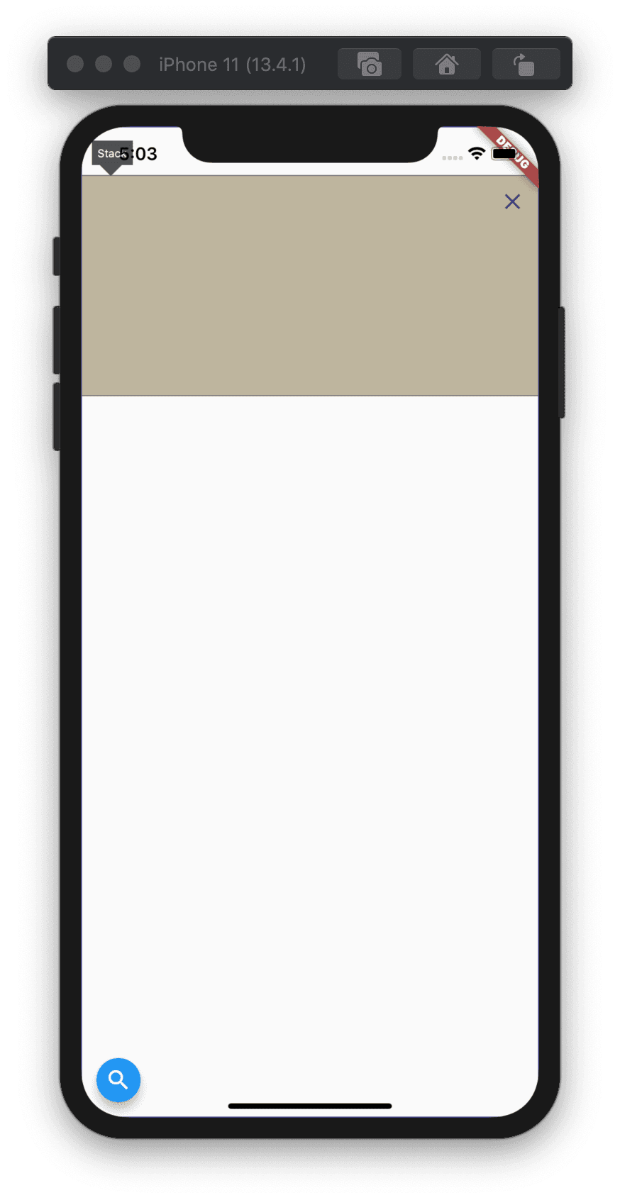
Cool! Everything should work now. Let's look at it visually :
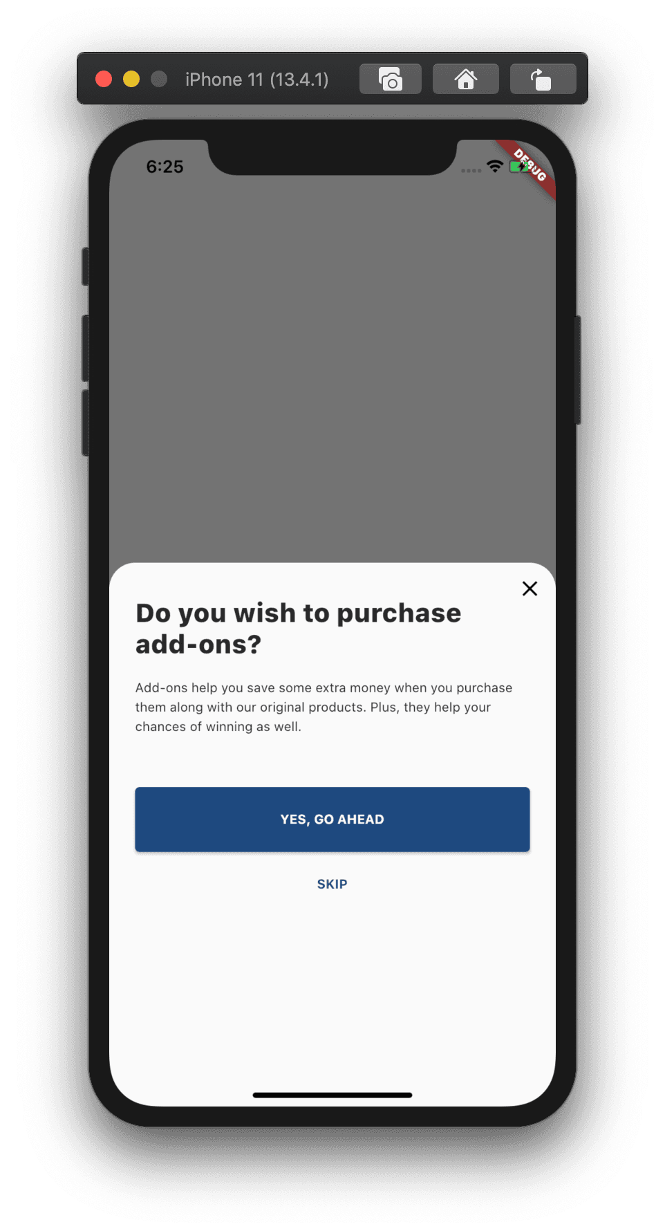
Dang! 😅 What just happened? Two immediate questions I had:
- Why is our Bottom Sheet now taking more space than the content?
- Why is it taking up almost half the height of the screen?
Now that we know what exactly the issue is, let's work together to solve it 😁
Using Dart Dev Tools
Let's first see which widget is causing our BottomSheet's height to increase by opening Dart DevTools. (without assuming it has to be Align with IconButton because adding it is what caused the issue, correct? 😜)
Note: I'm not going into details on how to use Dart DevTools step by step. If you'd like to know more about them, I'd suggest checking out the official docs or article I linked earlier in this post.
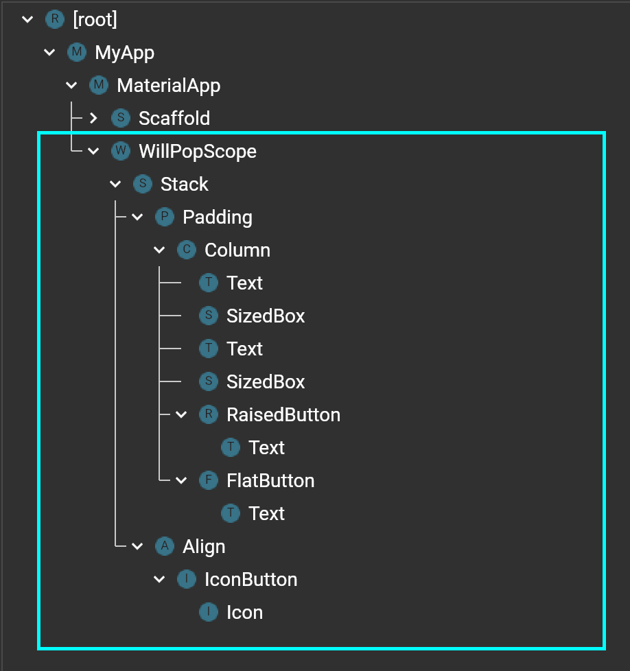
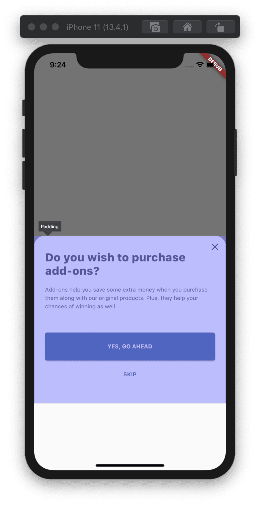
The highlighted area represents our BottomSheet's layout hierarchy. Let's turn on Select Widget mode in DevTool and start selecting widgets to understand which widget is taking how much space in the layout.
Selecting Stack in the widget tree shows the following on our device.
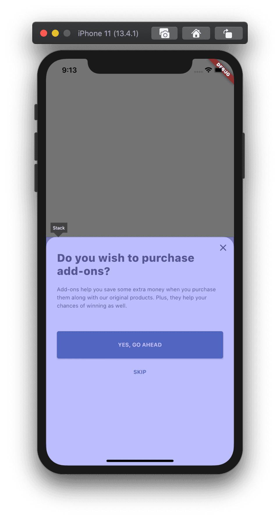
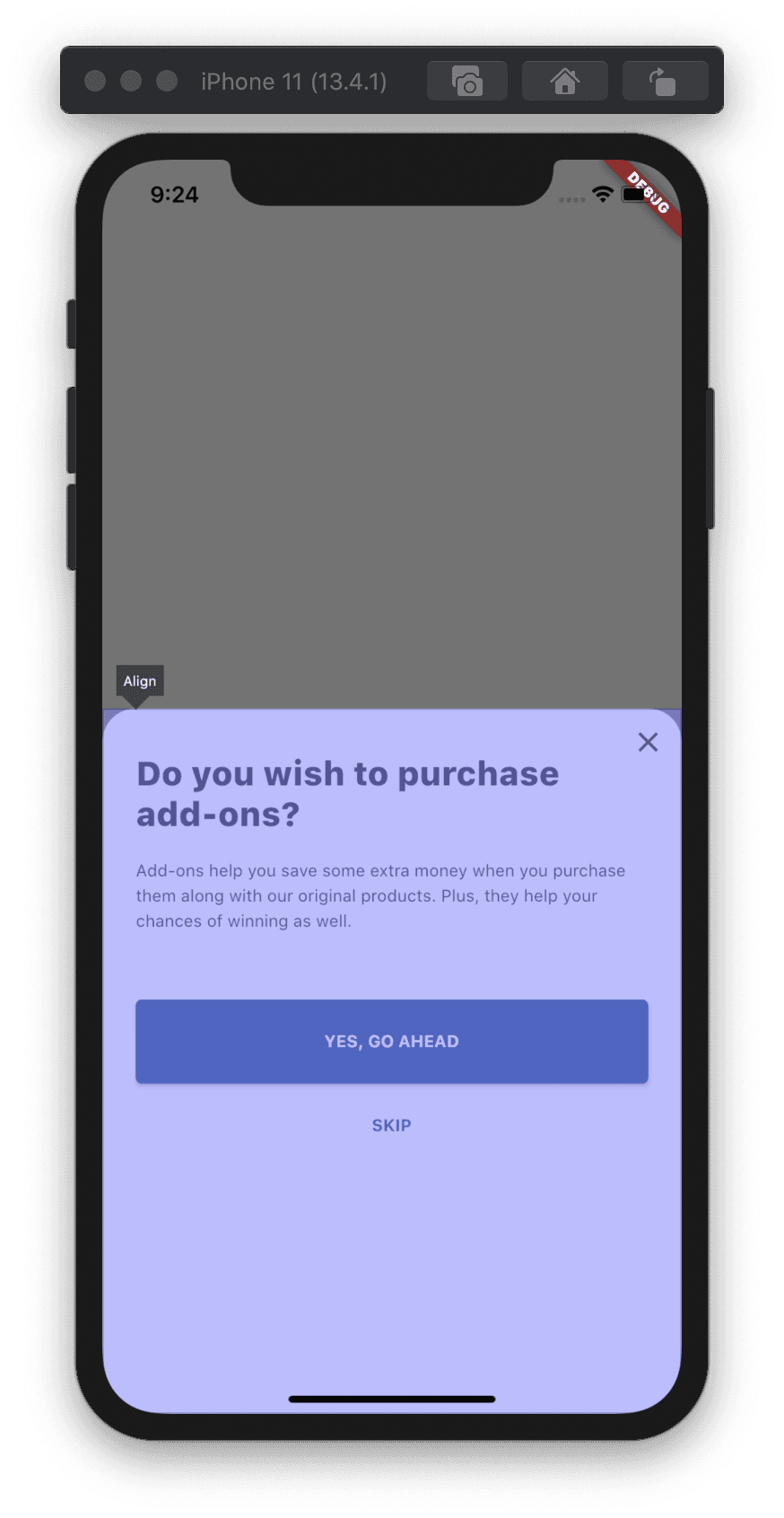
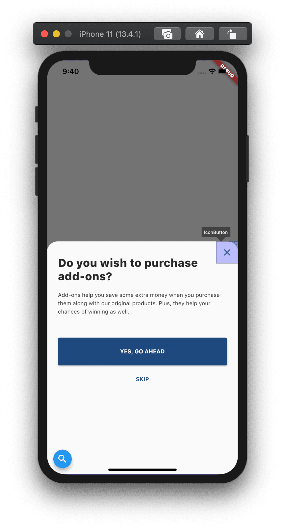
We will start with selecting Stack's children one by one.
- Padding with Column
- Align
- IconButton
Padding With Column selected:
With Align selected:
With IconButton selected:
Looking at the above three screenshots, my immediate observations were:
- Padding with Column widget is taking up the correct amount of space based on its content size with mainAxisSize set to MainAxis.min.
- IconButton is correctly taking up its default icon size of 32(24 + 8 padding).
However, what is happening with Align widget over here? 🤔 Why is it taking up the entire space of BottomSheet? And, why is BottomSheet taking up a little bit more than a half height of our screen in the first place? So many questions ❓❓❓
Let's look at the Flutter documentation for all the associated widgets to figure out where we're going wrong.
Reading Flutter documentation
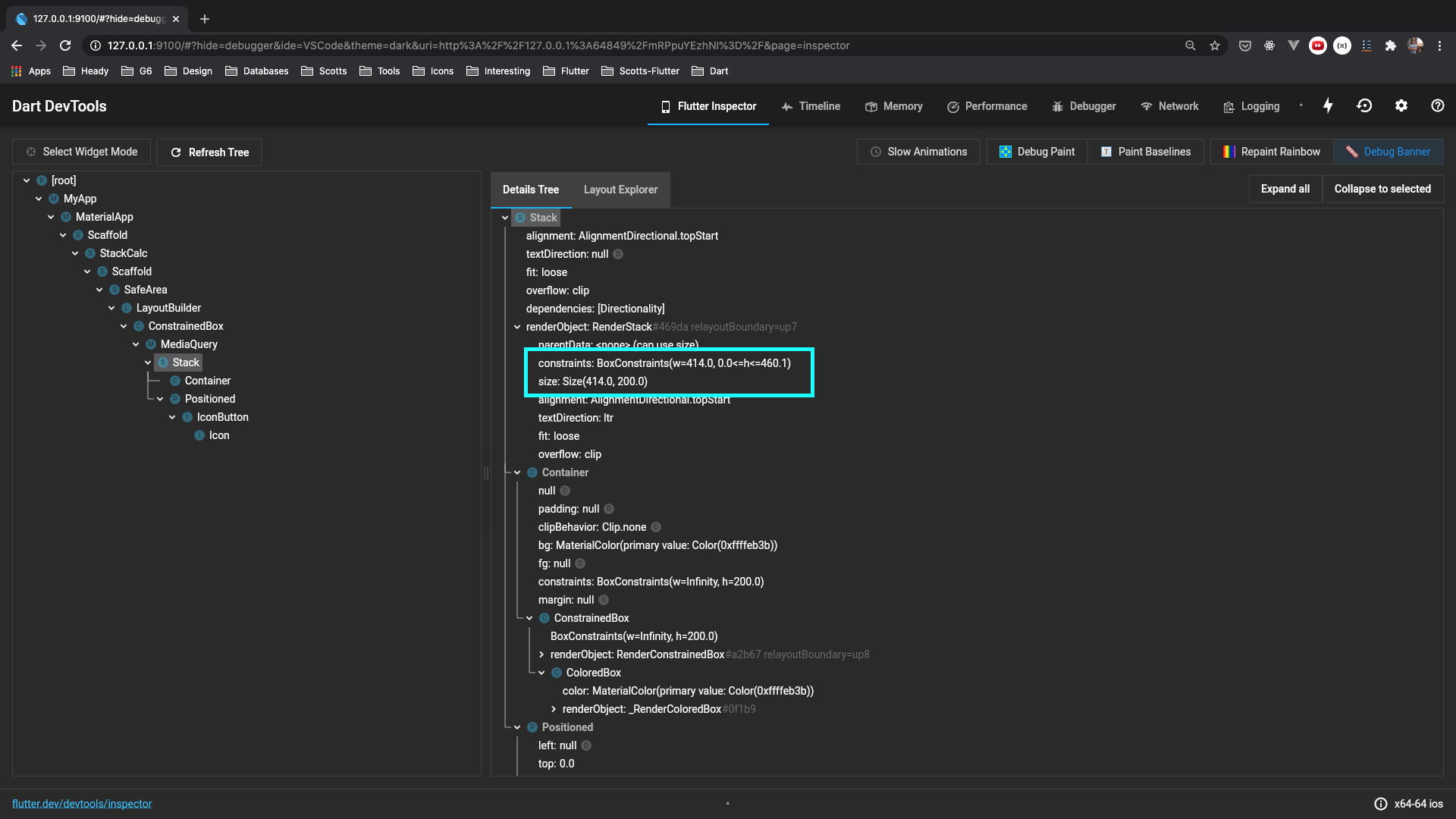
Before we start reading the documentation of the widgets in focus, let's first look at the dimensions of the Stack widget in DevTools.
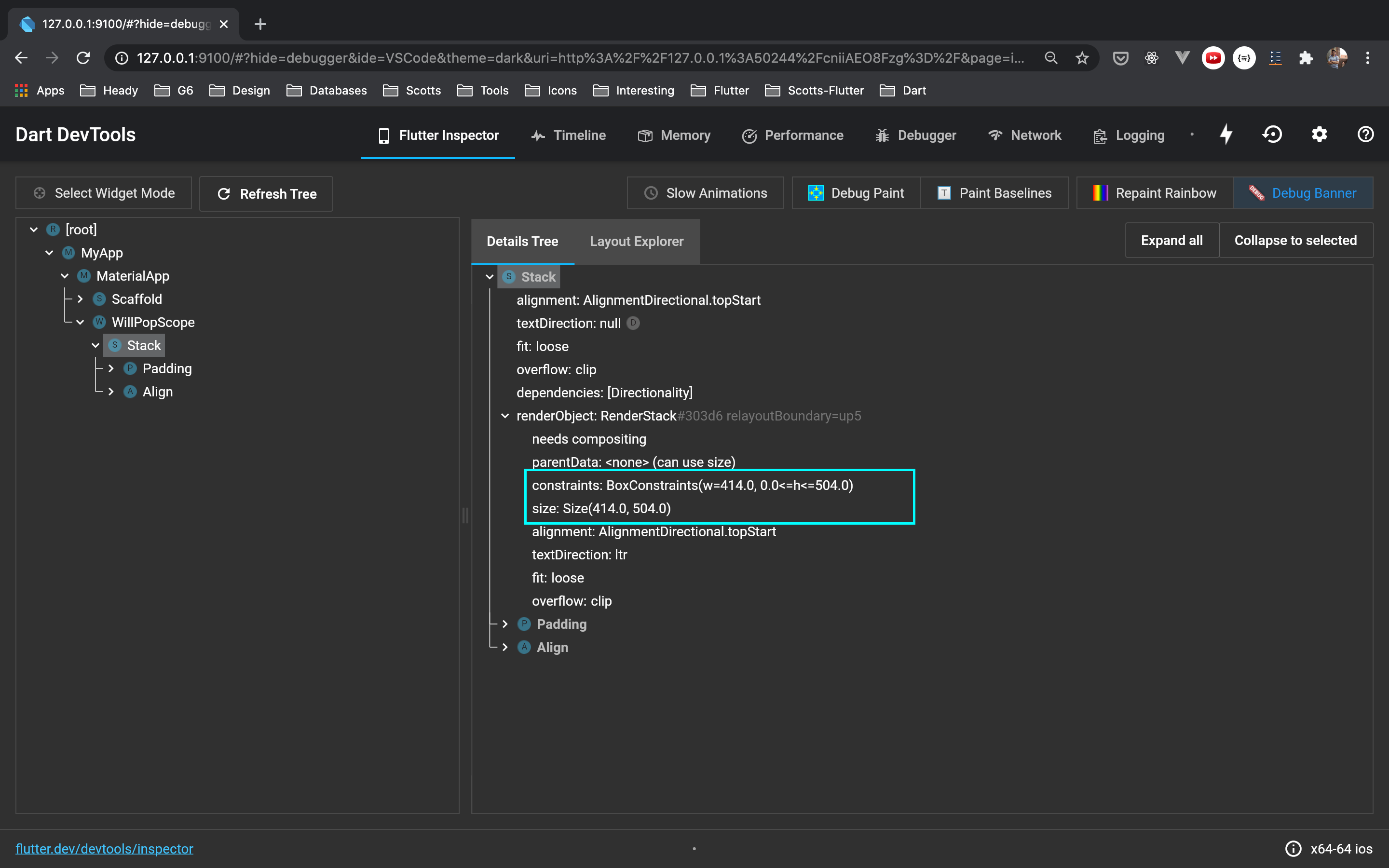
Interesting! It has Box Constraints set to w=414.0 and 0.0<=h<=504.0.
It means it doesn't consider the width of its children and takes up full-screen width anyway.
However, it is constrained to a max height of 504.0, which is precisely 9/16 of the screen height.
And if we look at the size, Stack's height is getting set to height=504.0, which means it takes the entire height it is allowed to take.
Is that how Stack calculates its height? But before we check that, let's focus on constraints set by BottomSheet, under which we're rendering our Stack Widget.
Using your "Go to Definition" keyboard shortcut of Editor/IDE, let's go and see the implementation of the showModalBottomSheet method.
Note: I'll refer to "Go to Definition" as "GTD" for the rest of the post. Also, I'd recommend following this process together so you can see other interesting details when navigating with me.
 return Navigator.of(context, rootNavigator: useRootNavigator).push(_ModalBottomSheetRoute<T>(
    builder: builder,
    ...
    ...
    // Removed for brevity
  ));
It is pushing _ModalBottomSheetRoute to our navigation stack. Let's continue by again using GTD shortcut and go to _ModalBottomSheetRoute's implementation
class _ModalBottomSheetRoute<T> extends PopupRoute<T>{
...
...
Widget buildPage(BuildContext context.
Animation<double> animation,
Animation<double> secondaryAnimation) {
...
...
Widget bottomSheet = MediaQuery.removePadding(
context: context,
removeTop: true,
child: _ModalBottomSheet<T>(
route: this,
...
...
),
);
...
return bottomSheet;
}
}
I'm ignoring other details and focussing on _ModalBottomSheet, which it renders. Let's use the GTD shortcut and see its implementation.
Widget build(BuildContext context) {
...
...
return AnimatedBuilder(
animation: widget.route.animation,
builder: (BuildContext context, Widget child) {
...
return Semantics(
...
child: ClipRect(
child: CustomSingleChildLayout(
delegate: _ModalBottomSheetLayout(animationValue, widget.isScrollControlled),
child: BottomSheet(
animationController: widget.route._animationController,
onClosing: () {
if (widget.route.isCurrent) {
Navigator.pop(context);
}
},
// This is what we provide in our
// `builder` method of
// `showModalBottomSheet()`.
builder: widget.route.builder,
...
...
),
),
),
);
},
);
}
It is a StatefulWidget wrapped with AnimatedBuilder for all bottom sheet animations we see when pushing and popping it. Nice!
What is CustomSingleChildLayout used for? Let's checkout using the GTD shortcut. Its documentation says the following:
/// A widget that defers the layout of its single child to a delegate.
///
/// The delegate can determine the layout constraints for the child and can
/// decide where to position the child. The delegate can also determine the size
/// of the parent, but the size of the parent cannot depend on the size of the
/// child.
class CustomSingleChildLayout extends SingleChildRenderObjectWidget {
So, it is the delegate of CustomSingleChildLayout which determines layout constraints for the child which is BottomSheet. Good! Moving on to _ModalBottomSheetLayout which is set as its delegate.
class _ModalBottomSheetLayout extends SingleChildLayoutDelegate {
_ModalBottomSheetLayout(this.progress, this.isScrollControlled);
final double progress;
final bool isScrollControlled;
BoxConstraints getConstraintsForChild(BoxConstraints constraints) {
return BoxConstraints(
minWidth: constraints.maxWidth,
maxWidth: constraints.maxWidth,
minHeight: 0.0,
maxHeight: isScrollControlled
? constraints.maxHeight
: constraints.maxHeight * 9.0 / 16.0,
);
}
...
...
}
THERE IT IS!! Our BottomSheet constraints are set here. :party_parrot:
Width:
final minWidth = constraints.maxWidth;
final maxWidth = constraints.maxWidth
Height:
final minHeight = 0.0;
final maxHeight = (9/16) * constraints.maxHeight;
Ohh! That is why all BottomSheets, by default, have full-screen width and can have a max height of 9/16 of the screen's height. Makes sense!
The previous Box Constraint of (w=414, 0<=h<=504), which we saw earlier in DevTool on the Stack Widget, makes sense now for width.
But, for height, it can take any height between 0 and 9/16 * screen height.
So, why is Stack taking up the entire height, then? Is that how Stack works? Let's find out.
I'd suggest taking a break. Please drink water/coffee, take a walk and return to this article later! 😅
Back after the break?! Let's move on by checking out Stack's widget's code.
It has excellent doc comments with examples on how to use it, but the one particular paragraph of our interest I found out was the following:
Each child of a [Stack] widget is either positioned or non-positioned.
Positioned children are those wrapped in a [Positioned] widget with at least one non-null property. The stack sizes itself to contain all the non-positioned children, which are positioned according to [alignment] (which defaults to the top-left corner in left-to-right environments and the top-right corner in right-to-left environments). The positioned children are then placed relative to the stack according to their top, right, bottom, and left properties.
Neat! Understood. Still, to clear up this concept related to Stack's sizing, I like to try this out in the playground project.
import 'package:flutter/material.dart';
class StackExample extends StatelessWidget {
Widget build(BuildContext context) {
return Scaffold(
body: SafeArea(
child: Stack(
children: <Widget>[
Container(
width: 350,
height: 100,
color: Colors.green,
),
Container(
width: 200,
height: 400,
color: Colors.yellow,
),
],
),
),
);
}
}
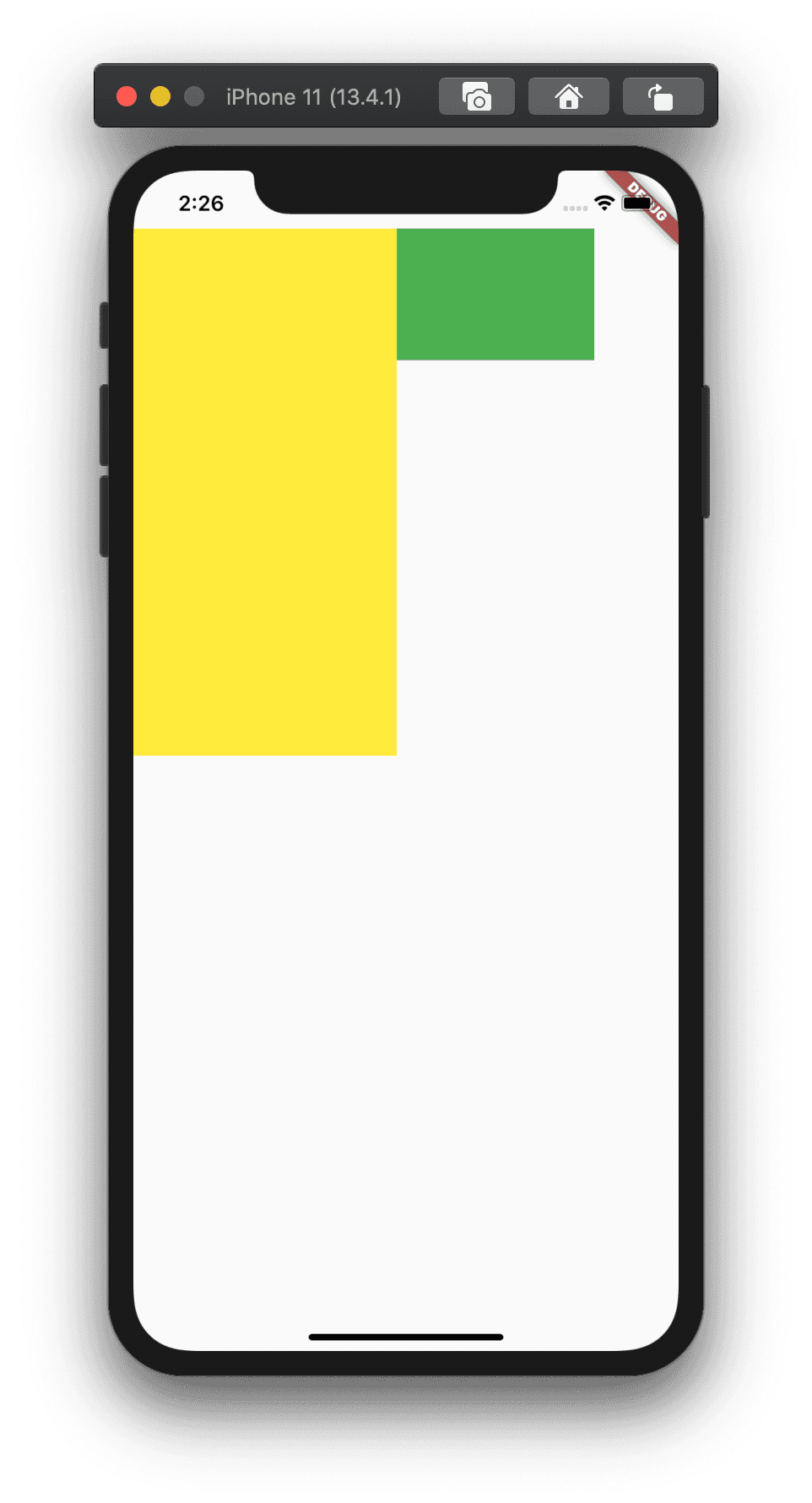
Based on the Stack's documentation, the size should be the max of both our non-positioned widgets(Container) sizes.
width  = max(350, 200) // => 350
height = max(100, 400) // => 400
Let's check out visually:
All good! How about we add combination of positioned and non-positioned children in Stack like below:
import 'package:flutter/material.dart';
class StackExample extends StatelessWidget {
Widget build(BuildContext context) {
return Scaffold(
body: SafeArea(
child: Stack(
children: <Widget>[
// Non-Positioned
Container(
width: double.infinity,
height: 450,
color: Colors.orange,
),
// Positioned to top-left
Positioned(
top: 0,
left: 0,
child: Container(
width: 350,
height: 100,
color: Colors.green,
),
),
// Positioned to top-right
Positioned(
top: 0,
right: 0,
child: Container(
width: 200,
height: 700,
color: Colors.yellow,
),
),
],
),
),
);
}
}
WDYT would be the width and height of the Stack?
As per documentation and our understanding, because there is only one non-positioned child, the size should be calculated like below:
width = max(450) // 450
height = max(double.infinity) // double.infinity
Checking out visually:
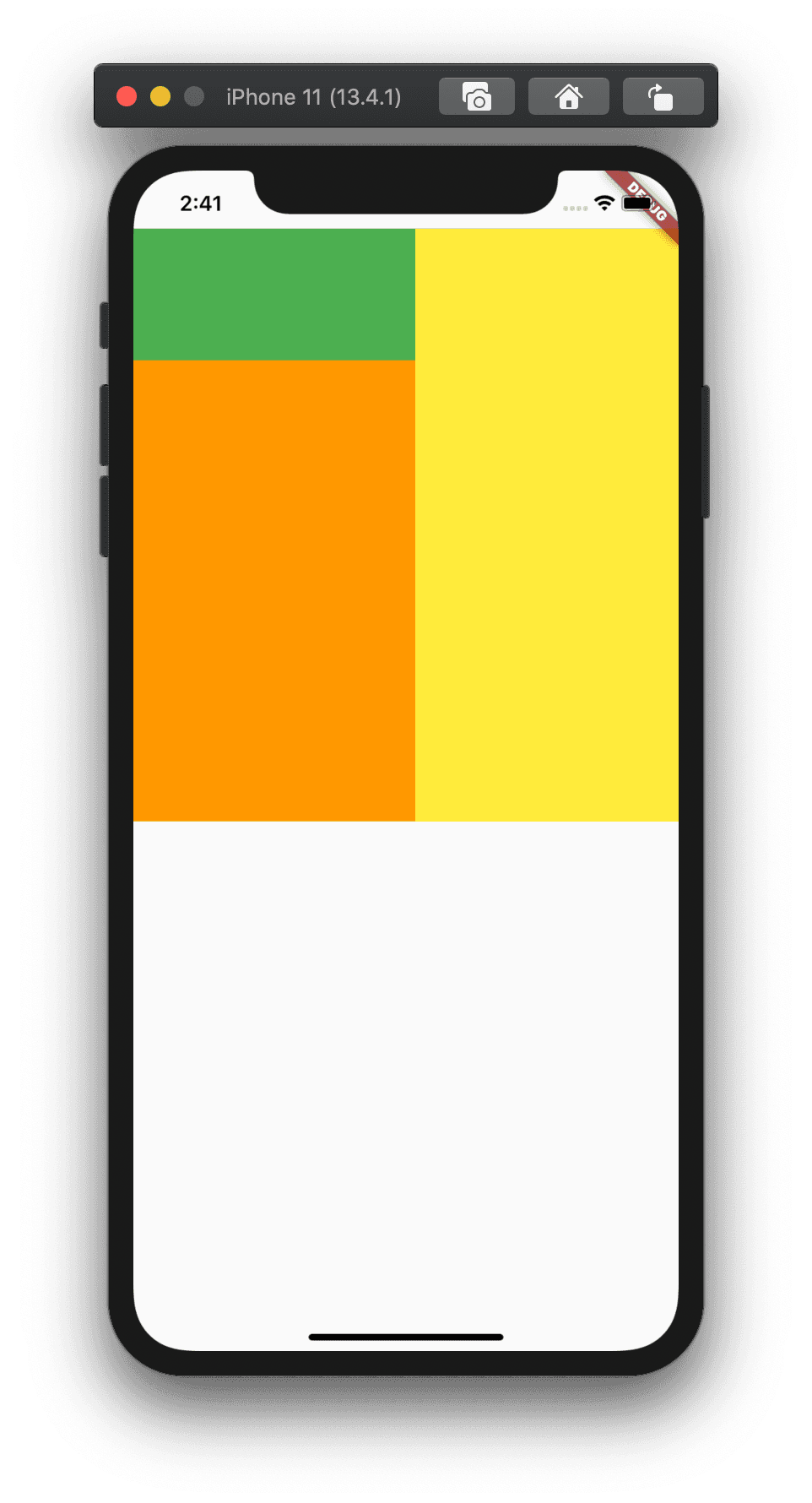
Fair enough! Wait, one of our Container widgets has a height equal to 700then how come the height of our Stack widget is getting set to 400?
Yes, that is because, by default, all positioned children who have a size greater than the max of all non-positioned children's size will get clipped because the default Overflow behaviour of Stack is set to
Overflow.clip.
All righty! After using DevTools and reading Flutter documentation, we now have a fair bit of understanding about the following:
- BottomSheet and how it sets constraints on its child widget.
- Stack and how it calculates the size according to its children.
Let's recreate the issue we're having using the example we just saw above but without BottomSheet. We will set similar BoxConstraints as we saw earlier and try to fix them.
Fixing Problem
import 'package:flutter/material.dart';
class StackExample extends StatelessWidget {
Widget build(BuildContext context) {
return Scaffold(
body: SafeArea(
child: LayoutBuilder(
builder: (context, constraints) {
return ConstrainedBox(
constraints: BoxConstraints(
minWidth: constraints.maxWidth,
maxWidth: constraints.maxWidth,
minHeight: 0.0,
maxHeight: constraints.maxHeight * 9.0 / 16.0,
),
child: Stack(
children: <Widget>[
Container(
width: double.infinity,
height: 200,
color: Colors.yellow,
),
Align(
alignment: Alignment.topRight,
child: IconButton(
icon: Icon(Icons.close),
onPressed: () {},
),
)
],
),
);
},
),
),
);
}
}
As per our understanding, Stack's size should equal the max of non-positioned children's size.
final containerWidth = double.infinity;
final iconButtonWidth = 40; // IconButton has default size set to 40. 24 - Icon size + 8 padding on all sides.

final containerHeight = 200;
final iconButtonHeight = 40;

width = max(containerWidth, iconButtonWidth); // double.infinity
height = max(containerHeight, iconButtonHeight); // 200
However, if you open DevTools again and check Stack's children's heights, you will see the same problem we had earlier. Its height is getting set equal to 9/16 * screenHeight and not to 200 as per our calculation 🤬
Haha! Back to using "Select Widget" mode in DevTool.
If you check in DevTool, the size of IconButton is correct(40), but the Align widget's size isn't.
Dang! It looks only piece in our puzzle we need help understanding now is the Align widget. For one last time(I promise!), let's check its documentation using the GTD shortcut. Again, solid doc comments with examples on how to use Align widget, but the one particular paragraph of interest in the documentation I found out was the following:
Point1 : This widget will be as big as possible if its dimensions are constrained and [widthFactor] and [heightFactor] are null.
Point2 : And, if a dimension is unconstrained and the corresponding size factor is null then the widget will match its child's size in that dimension.
The Align widget is wrapped under the Constrained dimension set by our BottomSheet's BoxConstraints. Plus, we haven't set widthFactor and heightFactor on it. So, it ticks all the checkboxes under pt1, thereby Align widget taking size as big as possible.
const size = Size(constraints.maxWidth, constrainst.maxHeight);
// where constraints.maxHeight = 9/16 * screenHeight
It looks like we didn't understand this about Align widget earlier. We were assuming it should do the job of aligning our IconButton at the correct place in the top right corner, which it did 😅 but thereby messing up Stack's height. What is the apparent replacement in this case? Positioned widget?
Let's try it out by replacing the Align with the Positioned widget.
import 'package:flutter/material.dart';
class StackCalc extends StatelessWidget {
Widget build(BuildContext context) {
return Scaffold(
body: SafeArea(
child: LayoutBuilder(
builder: (context, constraints) {
return ConstrainedBox(
constraints: BoxConstraints(
minWidth: constraints.maxWidth,
maxWidth: constraints.maxWidth,
minHeight: 0.0,
maxHeight: constraints.maxHeight * 9.0 / 16.0,
),
child: MediaQuery.removePadding(
context: context,
removeTop: true,
child: Stack(
children: <Widget>[
Container(
width: double.infinity,
height: 200,
color: Colors.yellow,
),
Positioned(
top: 0,
right: 0,
child: IconButton(
icon: Icon(Icons.close),
onPressed: () {},
),
)
],
),
),
);
},
),
),
);
}
}
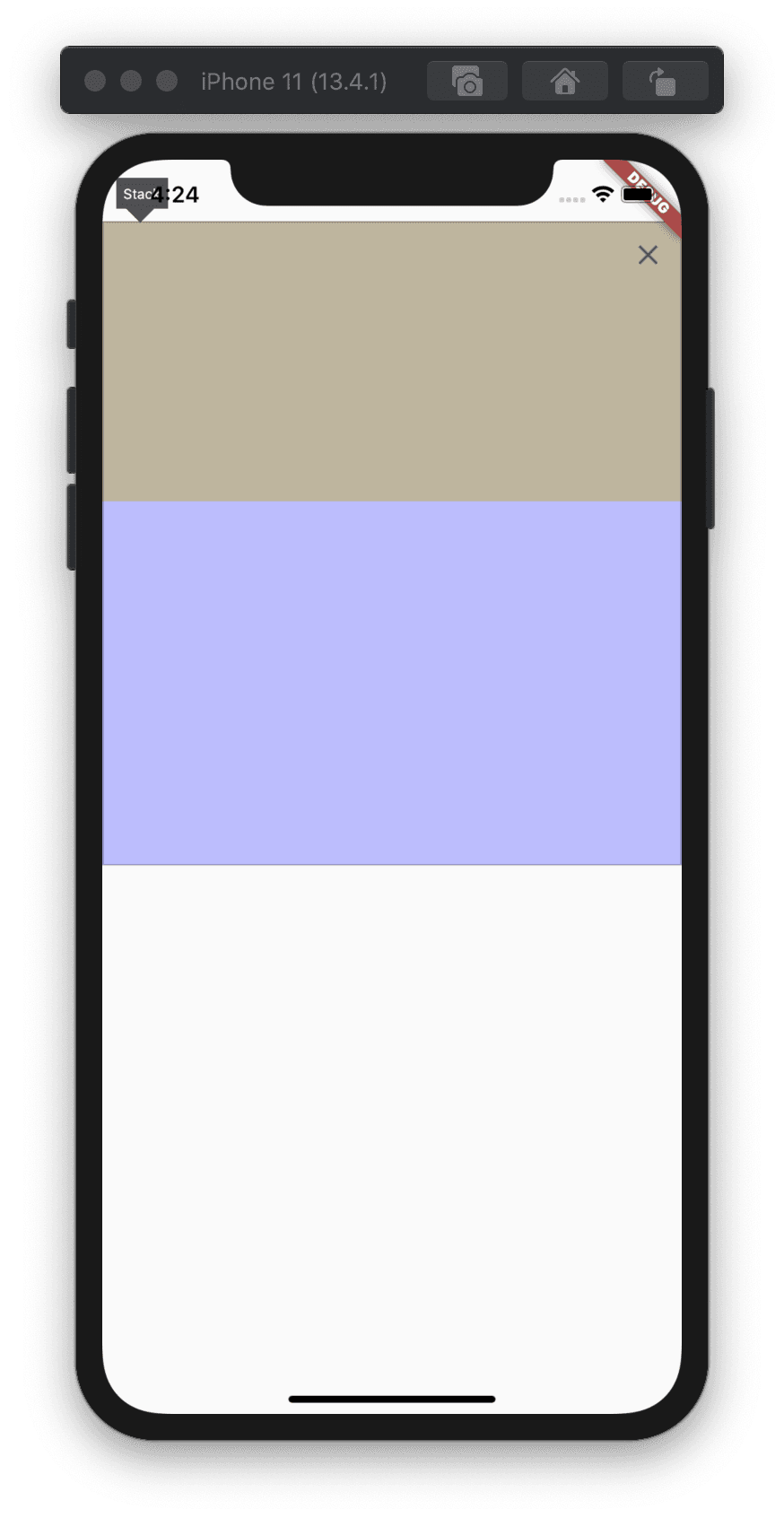
Let's recheck Stack's size in both DevTools and Select Widget mode.
Details tree:
Select Widget mode:
Finally! Yay! We fixed it. Let's update our wrapper function by swapping Align with the Positioned widget.
import 'package:flutter/material.dart';
Future<T> showBottomDialog<T>({
BuildContext context,
String title,
String content,
Widget titleWidget,
Widget contentWidget,
List<Widget> actions,
bool allowBackNavigation = false,
bool showCloseButton = false,
Function onClose,
}) {
assert(title != null || titleWidget != null,
'title and titleWidget must not both be null');
assert(content != null || contentWidget != null,
'content and contentWidget must not both be null');
final theme = Theme.of(context);
return showModalBottomSheet(
...
builder: (context) => WillPopScope(
...
child: Stack(
children: <Widget>[
Padding(
padding: const EdgeInsets.symmetric(horizontal: 24, vertical: 32),
child: Column(
mainAxisSize: MainAxisSize.min,
mainAxisAlignment: MainAxisAlignment.start,
crossAxisAlignment: CrossAxisAlignment.stretch,
children: [
...
],
),
),
if (showCloseButton)
Positioned(
top: 0,
right: 0,
child: IconButton(
icon: Icon(
Icons.close,
size: 24,
),
onPressed: onClose ?? () => Navigator.pop(context),
),
),
],
),
),
);
}
Looks Good ❤️
Closing Note
You'd think it was apparent to change it from the Align to Positioned widget if I had read the Align and Positioned widget documents 🙈
TBH, I did that too 😛 and immediately replaced Align with Positioned widget. However, I realised I don't understand how all these widgets, like BoxConstraints, BottomSheet, Stack, Align, Positioned, etc., work and calculate their sizes. It looked like a solid opportunity to learn and share it with everyone. I hope this will help someone use the similar debugging process of DevTools & Documentation to debug and fix similar layout issues they might face in future.
Thanks for reading 🙂